Shadows
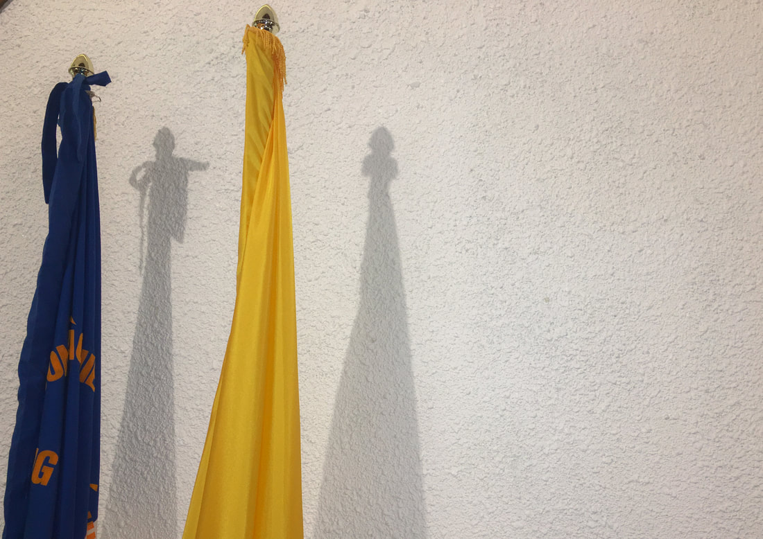
This photo was taken at my Vietnamese church. It consists of two flags that sit on the alter. The shadow cast by the flags resembles a man pointing at a woman beside her. It gives an essence of guilt as it almost seems like the man is pointing at the women convicting her of something. The popcorn texture of the wall helps enhance the idea of chaos which typically comes with conviction. Treatments applied to the photo includes a custom white balance and increasing the contrast between the colours of the flags to add more interest in the photo. The highlights were brought down to help add more dept to the shadows; hence, why shadows were also brought up slightly in the process of editing. Although there aren't many lines in the photo, if you start at the bottom of the photo the flags draw your eyes up to where the shadow of the man and carries you to the women.
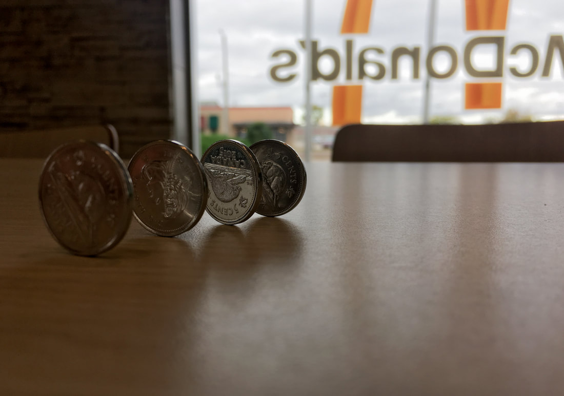
This is a photograph of nickels that are lined up creating a slight shadow on the table. Although the shadows aren't as prominent as others, I like how it creates a progressive shadow affect showing where the source of light in the photo is. Since the nickels are closer to the lens creating the effect of a shallow dept of field. Looking back on this photo now, I would want to change the second nickel in the photo as it is the only one with heads in the photo rather than tails, but O also like how it is something different because it adds a contrast to the photo. With this photo, the exposure was brought up as well as the highlights to create more contrast since this photo was taken in a dim setting. Whites were brought all the way down so that the light from the window wouldn't make it overblown. This photo creates an almost gradient effect as on the left side of the photo, it is quite dark and as you move to the right side it gradually gets brighter.
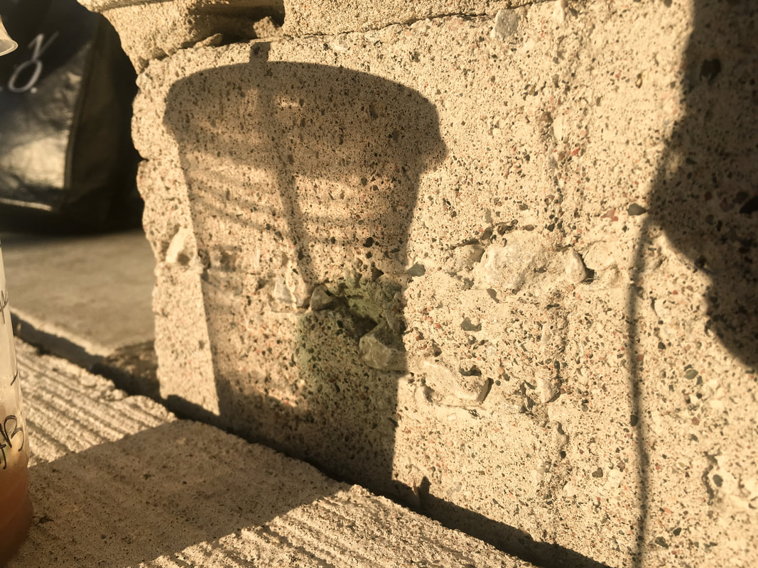
This is a photograph of a shadow of a Starbucks cup. I feel that this is a good photo because it consists of a variation in lights. The slightly overblown areas of the shadow give it more dimension along with the texture present on the wall. A tinge of green can be seen in the shadow from where the logo sits on the cup and it also adds more character and dimension the shadow. Adjustments were made to the shadows in order to make it pop more against the textured wall and the clarity was also increased so that the lines of the cup were more defined. The saturation was also increased as the photo was taken on a dull morning; therefore, the increase adds the illusion of a more sunny and bright day with a more prominent shadow.
